A visitor says your page is hard to use on a phone: they tap an article, and the page opens with a block of sidebar information where the article should be. The article is there, but they have to scroll past everything else to reach it. Nothing is “broken”, and the page loads fine. Still, the visitor can’t easily do what they came to do.
A cause like this can be a single line of CSS. For example, say a stylesheet gives the sidebar a lower order value than the main content inside a flexbox container, so on narrow screens the sidebar is displayed first. The HTML itself still lists the article first, which is why a quick look at the source suggests everything is fine. That’s the first check: compare the document order with the visual order. They are allowed to differ, but when they do, someone should have chosen that deliberately.
Removing the override is the easy part. A fix like that is one deleted line, which makes it tempting to call it done after looking at one phone-sized window. I’d check at least three things first. Does the article now appear first at several widths, including the ones just above and below the breakpoint? Does keyboard tabbing follow the order you see on screen, since tab order follows the document and not the layout? And does the visitor get the new version, rather than a cached copy of the old stylesheet?
That last question matters more than it sounds. Browsers, plugins, and content delivery networks may all keep an old stylesheet after you’ve uploaded the new one, so the fix can be correct and still not reach visitors. Load the deployed page, check that the changed rule is actually in the file being served, and then look at the page again.
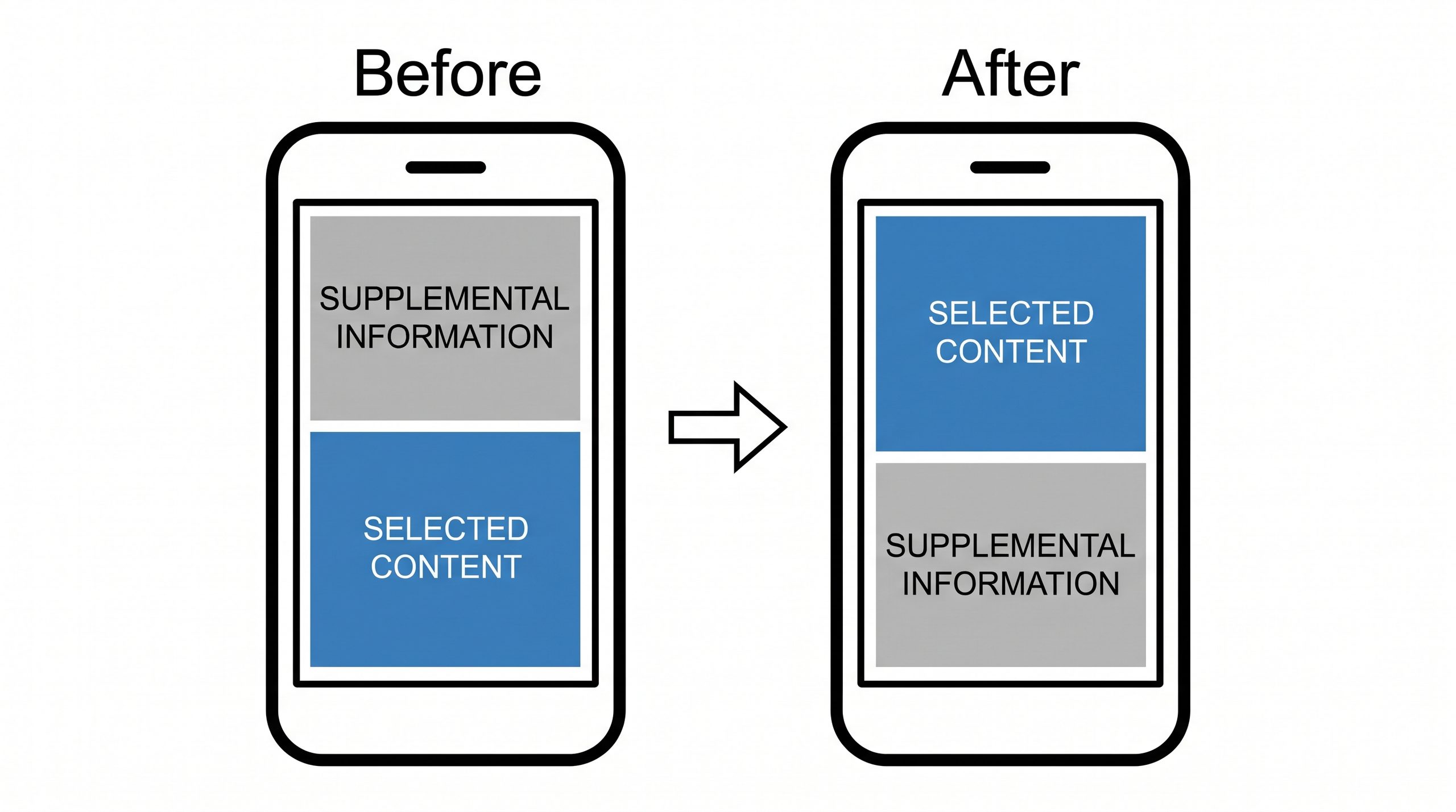
A simple wireframe makes the problem easy to see: a phone-shaped box with a block labeled “selected content” and one labeled “supplemental information”, before and after the change. The reordered version looks like a minor styling choice until you imagine holding the phone.
Before the next small layout change, write down the task a visitor is trying to complete, and test that task on a narrow screen.
—jhunterj